When examining all four covers, the largest similarity is the text present on the page. It is interesting to note which covers prioritize the author's name, evident by the size of the text and the location on the page. For example, one cover (with the internal organs outlined in wire) has Kazuo Ishiguro's name in relatively small text at the bottom, yet centrally located. This is very different from the cover with the yellow background, as it highlights the author's name, by making it the largest text on the page and placing it in the center of the cover. Text that is also present is the title, which varies greatly on every cover. Also, three out of the four covers have some sort of quote of praise on it. This probably is utilized to influence people to buy the book. In addition, these quotes come from accredited institutions, using ethos to further influence a potential reader.
Visually, these covers have some similarities but mostly differences. Two of the covers showcase a girl, though one is a real picture and one appears to be painted. One of the other covers displays an empty landscape, of a dock on the water during either the unset or sunrise. The most different of the covers, my personal favorite, i the cover of a human body and organs outlined in barbed wire. It has cooler colors than the other covers, and a more intense mood.
The two covers I selected for further analysis are:
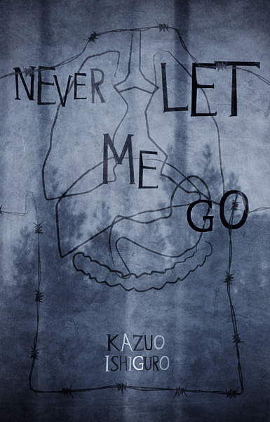

When I first saw the cover of the book with the girl on it, it seemed to be a young girl playing or running, due to the blurriness. For me, this reflected a happy mood, Upon seeing the other book cover, I felt creeped out yet intrigued. If I had no knowledge of the book I would have no idea what that cover was representing. Now that I have read bout half of the novel, this cover has a very deep meaning. First off, it shows wires outlining the human organs, which they take from children raised for this purpose. Secondly, barbed wire traces the outline of the body, as if to represent trying to keep someone out. The other cover has less of a direct correlation with the novel. Before reading the novel I might have thought it was about some girl falling in love, due to a combination of the image of the girl, the warm colors, the movement and the title. Now I see vaguely how it relates. The story features a girl, running from her fate, or at least afraid of it. The cover could be interpreted as Kathy H. running from her organ donation, and it seems as if she is running away from the person looking at the cover. In this case, the POV could be from her society, her future, or a specific person, such as Madame. In the other cover, we could be looking from the POV of whoever came up with the idea to use clones as a source of organs. This is due to the fact that they see this person's body as purely organs inside a skin they have to somehow get through (barbed wire). The person displayed represents any of the clones, as they are seen as only organs to most people. This cover hits on one of the main themes of the book, such as the morality of taking organs from these clones. (I just realized I've been writing under the assumption that they are clones, though that's just an educated guess) This reflects on the society as valuing clones as less than people, due to the value of their organs being more important than the individual clone. The other cover could represent how they brainwash the clones into accepting their fate, and that leads them into a world of confusion when it comes to what is actually going to happen to them and why. The girl running through just a yellow background is a symbol of the confusion thee kids face. It would appear these two books were made by completely different people. The "feel" of them are different to me. The yellow background is very bright, though possibly frantic, also potential playful. It seems to be the cover of a wistful and emotional yet ultimately happy novel. The other cover as a very dark and twisted feel to it, due to the eerie feeling one gets when looking at a human with only the organs outlined, Also the colors and font work together to continue the really creepy feeling of the cover. For these reasons I feel these different cover would attract different readers, readers who like to read novels with the qualities I spoke of.
Don't judge a book by it's cover? More like analyze a book by it's cover.

